Modern Contemporary Crockery Unit – Reveal Post
Hey…good to see you again on my blog… Today we are going to see the final post and photos of Modern contemporary crockery unit.
Thank you for being along in this journey with me. I have just started to write blogs with my experiences that I have on the ground so just let me know how do you feel reading about the same…but to just let you know it’s directly from my heart!! Moreover, do let me know what else I can add to make it more informative. Do here to get updates on my blogs.
Now let’s begin with this final post for which we have been waiting since long. As I have explained more and less everything about this area in my Introduction and Material Selection blog. Today I will just take you through the photographs and though they are self-explanatory I will still explain them a bit.
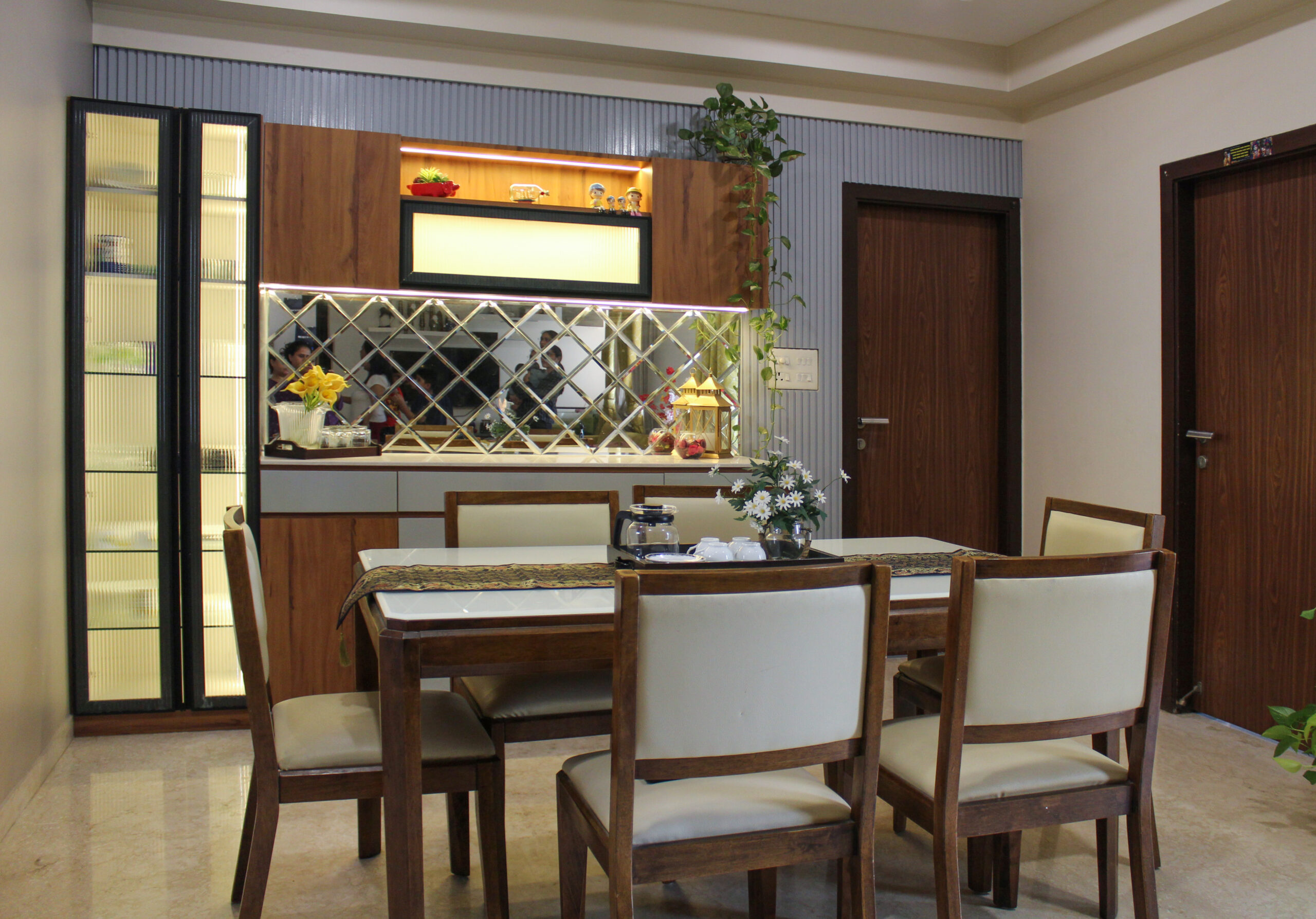
So here goes the first photograph. As I discussed in earlier blog we had to use grey and wood so below is the result of our hard work.

Lorem ipsum dolor sit amet, consectetur adipiscing elit. Ut elit tellus, luctus nec ullamcorper mattis, pulvinar dapibus leo.
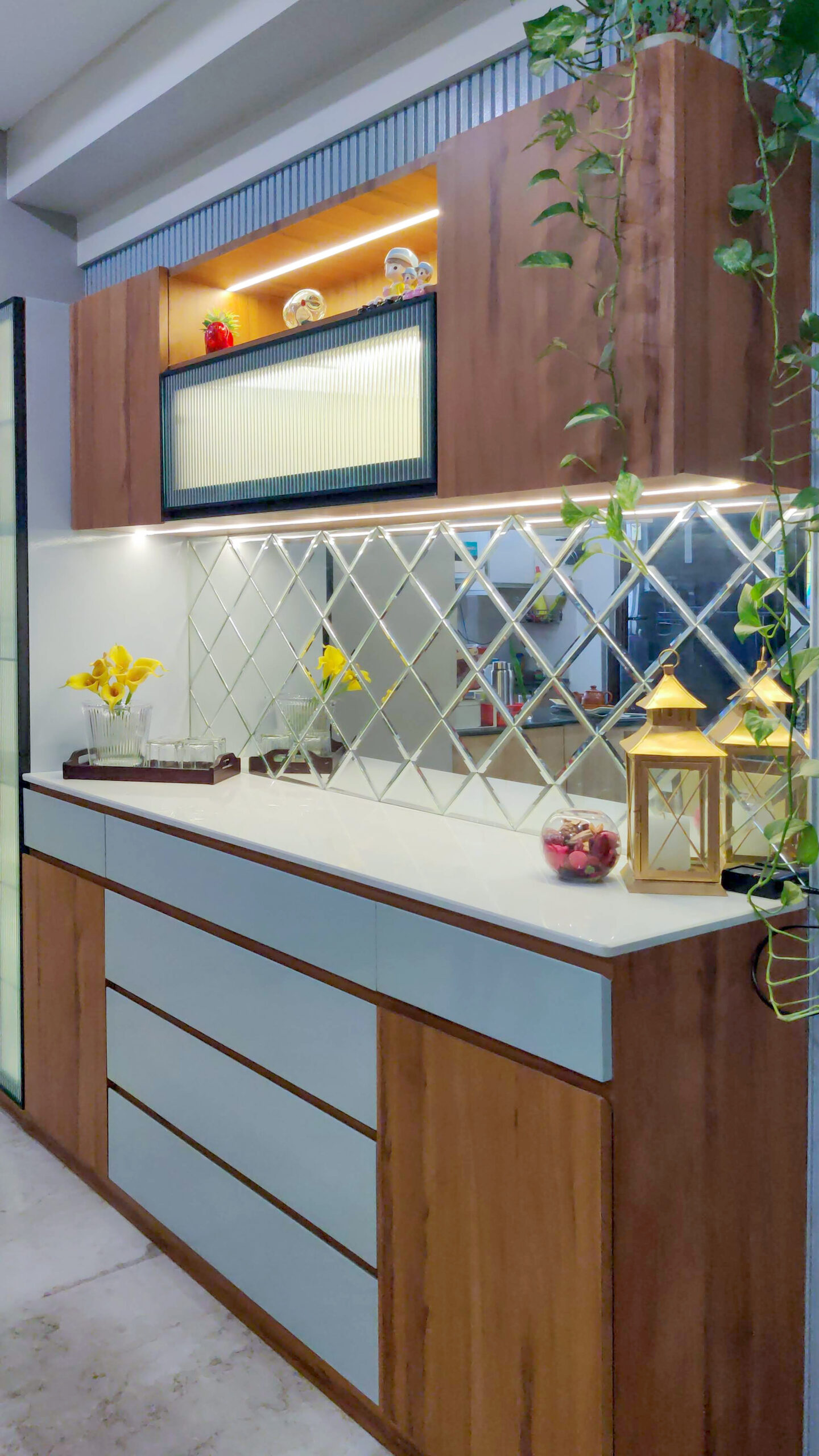
We had made it modern-contemporary by adding the elements like metal framed fluted glass and fluted panel. Moreover, we had also used checkered glass to break the monotony.
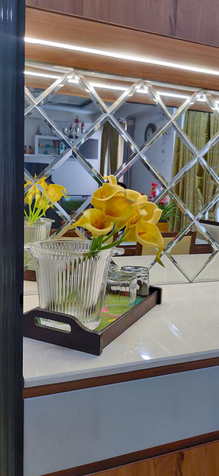
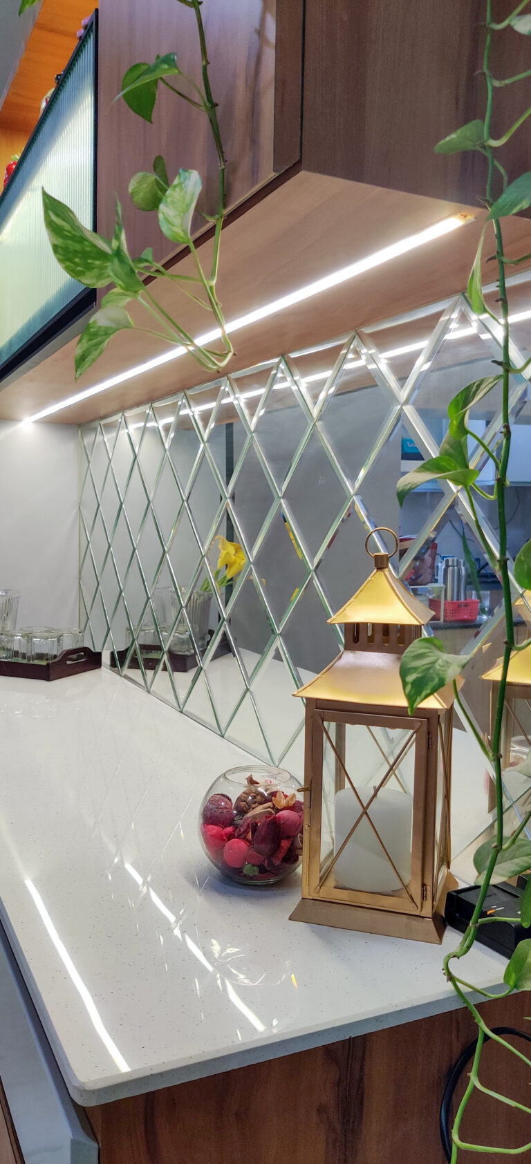
Also as I have not yet talked about light yet.. we had given sleek profile light to take the design to next level. Light plays a very important role in every space whether it’s a room or a crockery unit like this it definitely value adds in the space. It adds warmth and accentuates space. Below are few glimpses of the same.
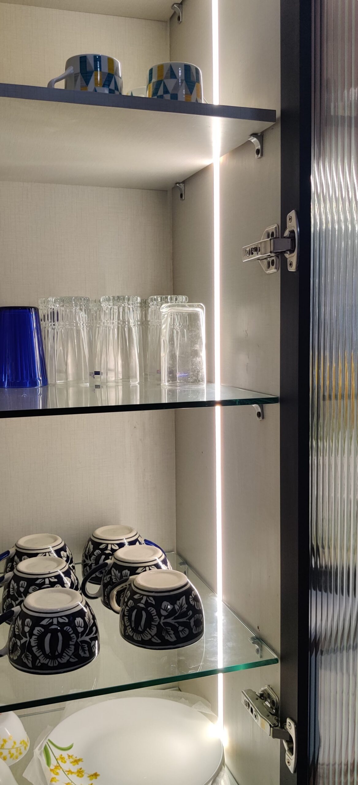
The crockery unit calls for ample of storage space, and we made sure that this requirement is fulfilled and aesthetics can be maintained. We have made a tall crockery unit with metal framed fluted glass. The non-symmetrical doors made it look even more appealing.
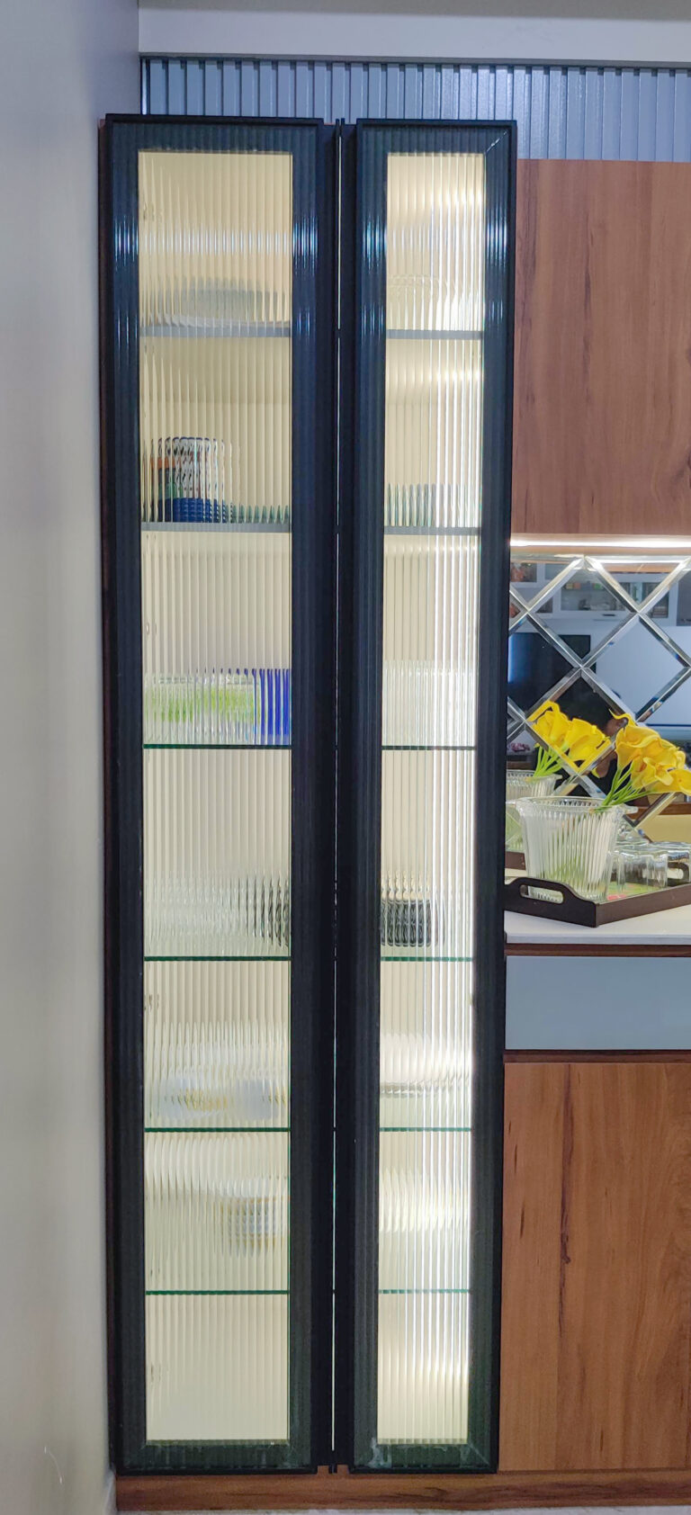
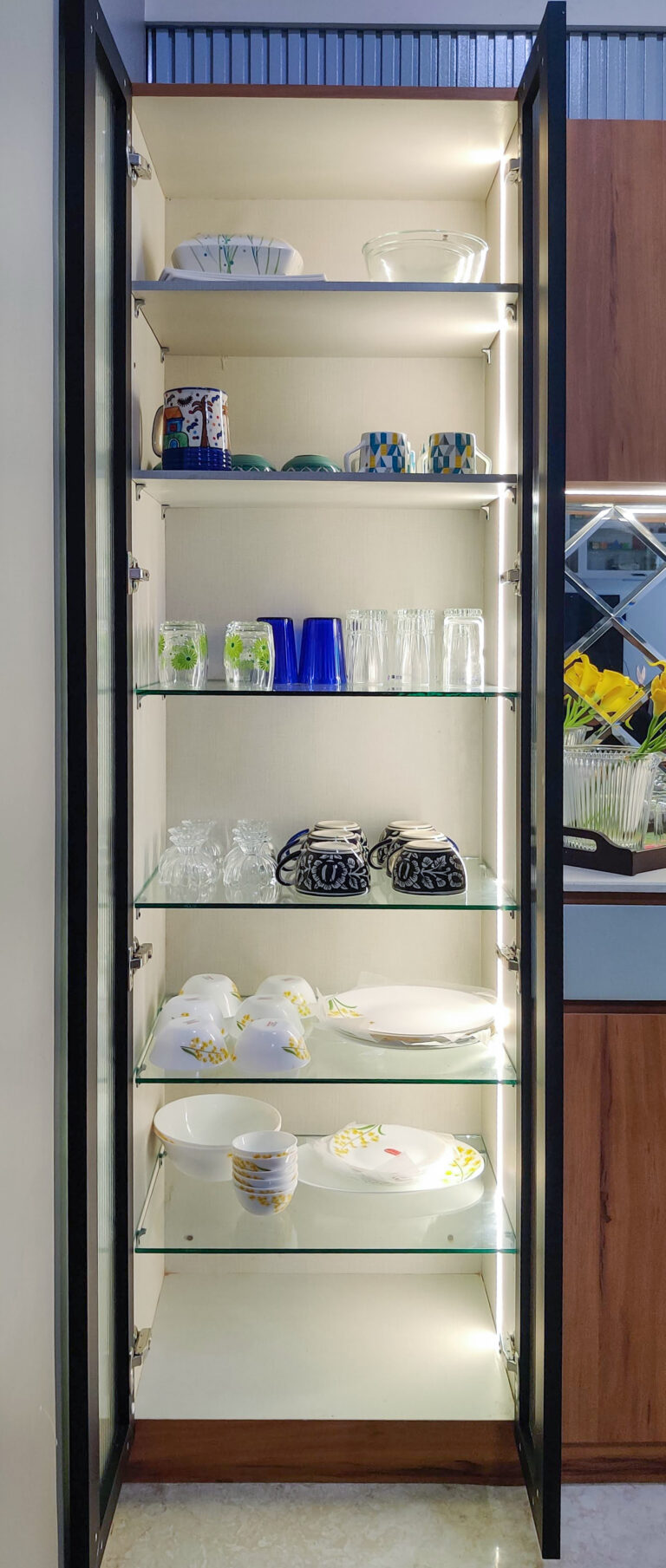
Overall, the space blends together by adding a fluted panel at the wall behind crockery unit. We have used the same color as that we have used on drawers so that the whole space looks cohesive.
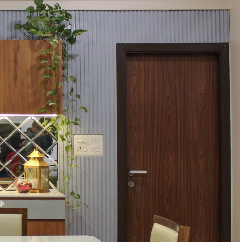
Lorem ipsum dolor sit amet, consectetur adipiscing elit. Ut elit tellus, luctus nec ullamcorper mattis, pulvinar dapibus leo.
Also giving a niche helps in making the area playful and some decorative elements can be added in there to give a contrast and adding a plant never hurts.
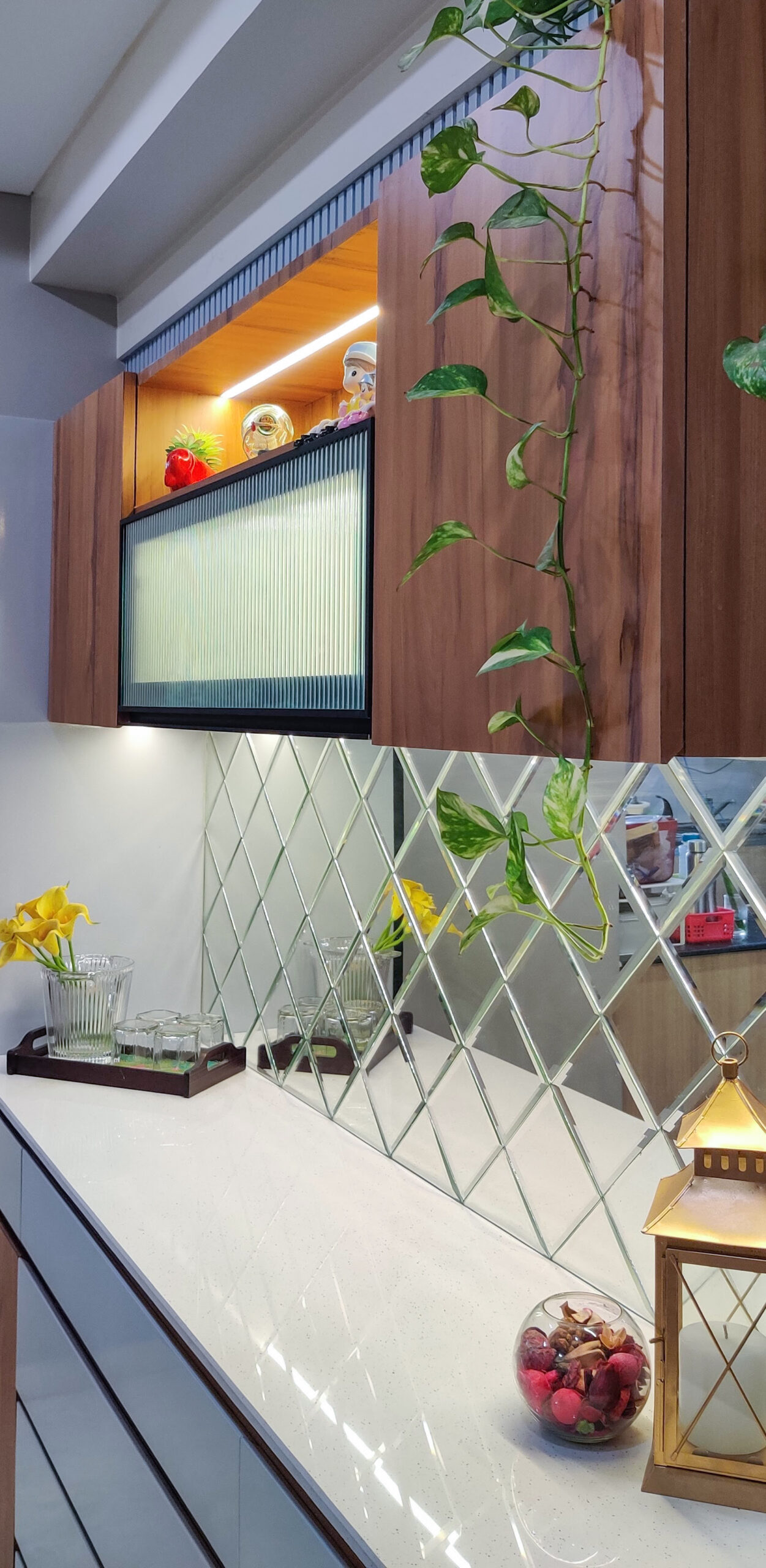
So here are some final photos of Modern-contemporary crockery unit.
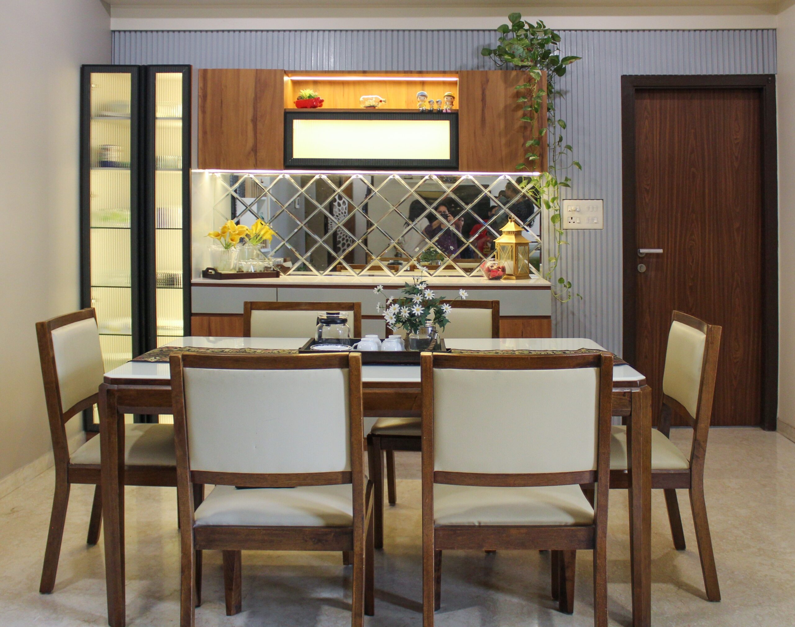
Do let me know how you find the overall design and most importantly the thought process!!
Remember to here to keep getting updates.
Until Then Take care and Keep learning!!
See you soon…
Megha Srivastava
Lorem ipsum dolor sit amet, consectetur adipiscing elit. Ut elit tellus, luctus nec ullamcorper mattis, pulvinar dapibus leo.
